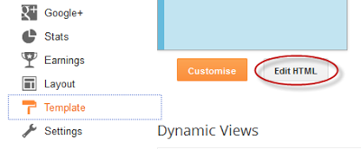
1. Go To Blogger - Template - Edit HTML

....and select the "expand widget templated" box:
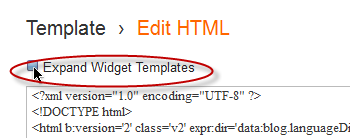
2. Search (using CTRL + F) for this piece of code:
</head>
3. Just above/before the </head> tag, add this code:
<link rel="stylesheet" href="http://helplogger.googlecode.com/svn/trunk/html/[helplogger.blogspot.com]Fixed Fade Out Menu.css"/>
<script type="text/javascript" src="http://helplogger.googlecode.com/svn/trunk/html/[helplogger.blogspot.com]jquery-1.3.2.js"></script>
<script type="text/javascript">
$(function() {
$(window).scroll(function(){
var scrollTop = $(window).scrollTop();
if(scrollTop != 0)
$('#nav').stop().animate({'opacity':'0.2'},400);
else
$('#nav').stop().animate({'opacity':'1'},400);
});
$('#nav').hover(
function (e) {
var scrollTop = $(window).scrollTop();
if(scrollTop != 0){
$('#nav').stop().animate({'opacity':'1'},400);
}
},
function (e) {
var scrollTop = $(window).scrollTop();
if(scrollTop != 0){
$('#nav').stop().animate({'opacity':'0.2'},400);
}
}
);
});
</script>
4) Now search for this tag:
<body>
If you can't find it, search for this one:
<body expr:class='"loading" + data:blog.mobileClass'>
5) Just below/after this code, copy and paste the following code:
<div id="nav">
<ul>
<li><a class="top" href="#top"><span></span></a></li>
<li><a class="bottom" href="#bottom"><span></span></a></li>
<li><a href='URL address'><span>Link 1</span></a></li>
<li><a href='URL address'><span>Link 2</span></a></li>
<li><a href='URL address'><span>Link 3</span></a></li>
<li><a href='URL address'><span>Link 4</span></a></li>
<li><a href='URL address'><span>Link 5</span></a></li>
<li><a href='URL address'><span>Link 6</span></a></li><li class="search">
<input type="text"/><input class="searchbutton" type="submit" value=""/>
</li>
</ul>
</div>
<div id="top"></div>
<div class="desc"></div>
<div id="bottom"></div>
<div class="scroll"></div>
Note: Replace URL address with the URL of your pages and Link 1, 2, 3, 4, 5, 6 with the name of the link that will appear in the menu.
6) Now click on the Save Template button and you're done ;)


0 komentar:
Post a Comment